The personalised packaging of Tolmanns Gin has won a Gold Award at the World Brand Design Society. A recognition for a project where every element is aligned — from bottle shape to closure.
Every detail tells the same story
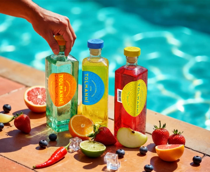
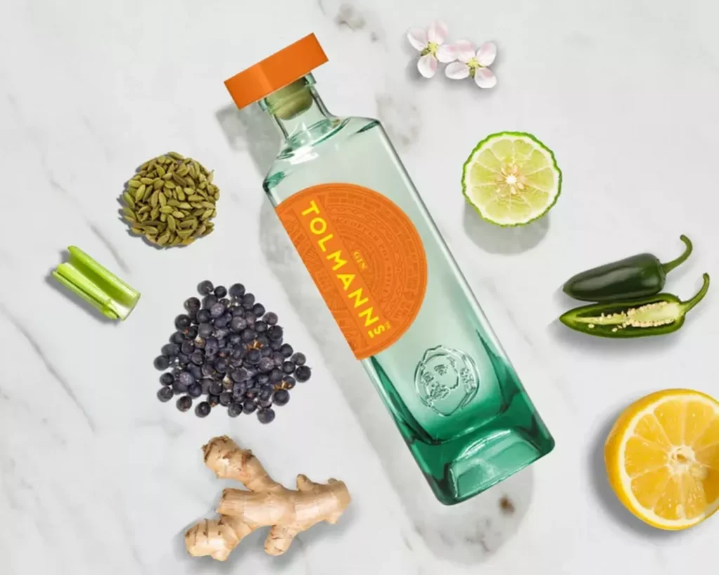
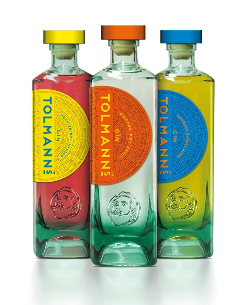
The central element is the 3D-printed portrait on the bottle. That portrait is consistently carried through the entire package: on the square wild flint glass bottle, in the cork and on the shrink sleeve. It is not a loose addition but a brand mark that binds the whole together.
Van Heertum Design was responsible for the design. The challenge: positioning a premium gin with packaging that combines material responsibility with visual impact. Glass, shape and tactility do the work.
Personalisation as a craft
Keizer International handled the personalisation of the bottle, the production of the corks in three versions and the shrink sleeves. The portrait is also incorporated into the cork — a detail that most producers do not expect, but that makes all the difference to the experience of the product.
Shape is the first impression. With Tolmanns Gin, that impression is carried through in every component. Square bottle, 3D portrait, personalised cork and closure. Everything works together.
We congratulate Tolmanns Gin and Van Heertum Design on this recognition.
Source: World Brand Design Society, Agency Design Awards 2025/26